Hello again! It’s time for another blog post!
We got done with all the art that was needed in the game last week so this week has been focused on polishing art that we already have, and add things that we put off because we were unsure if we would be able to make it due to the time we had on the project.
We wanted to fine tune our animations that we had, so I started with going through the melee enemies to see how I could make the animation look better. We are limited to not changing how many frames and how fast the animation is because our programmers still have a lot of work to do.
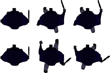
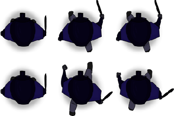
I went through every frame of the walking animation for the melee enemy and noticed rather fast that there were a lot of colors going outside lines and lines that were not supposed to be there. I started by correcting this by erasing and adding color and lines where I wanted them. I also wanted to add more detail to the melee enemy so I gave him some highlights and shadow to give the animation some depth and liveliness. I also had to change the color of the shoulders because it merged to well with the street that we use in the game, so I changed it to a lighter blue.
The job did take rather long time because it was a lot of zooming in and out, jumping from different frames and checking so everything worked well together. I also had some trouble with Phoshops animation system because I changed around with layers and folders to give myself a better structure in the Photoshop file. This is not a hard thing to fix it is just a bit annoying and takes some time.
Now when I was done with the fixing the animation to this point I knew that I wanted to make the melee enemy’s walk look more alive and not as stiff so I added that his shoulders moves when he is walking but I decided against making his head turn as well because I wanted the feeling of that he is marching. I was really happy with the outcome of this and I believe that I really got the feeling that he is marching.
the left animation is the old movement animation for the melee enemy and the right one is the new one. please click on the animations to take away the ugly white things that outline the character!
For the rest of the week I will be doing the same thing for the ranged enemy. I will also start to look at both of the police enemies’ attacks to see if there is anything there I can do to make it look better!
Thanks for reading and in till next time!


The post is focused and remains on topic throughout. Your goals and what you want to accomplish is clearly defined and sound. Colour is indeed important as it enables contrast in the image and for the eye to make out what is what on the screen. It’s a wise choice that you waited with the clean up until later on in the project, as you want to know that you’ve got the right aesthetics for the game before committing all your resources on those particular concepts. You want to make sure that you’ve got the idea, or essence of the game nailed down before prioritising making it look pretty.
Perception is also an important factor and added depth can contribute to the experience tremendously. Your images show this clearly, as the updated version has a lot more information portrayed simply by having its highlights adjusted. Your emphasis on getting the animation more life-like also helped a great deal with creating more believable movement just by considering subtle things such as the shoulder pads. Everything you’ve described is clearly and easily understood just because you showed both the old and new version of the model’s animation. It really does give it a sense of rigid momentum seen in a militaristic march.
Nothing more to add apart from that you’ve done a good job and seem to be on the right track, keep it up!
Björn Erik Berndtsson. Graphics and Game Design.